

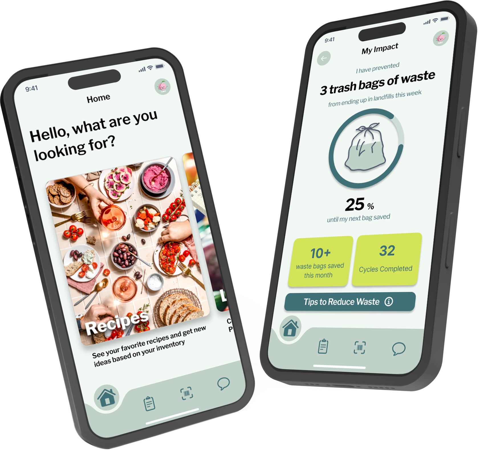
An Efficient Kitchen Organization tool!
EKO is a prototyped app that reduces food waste, unlocks culinary creativity, and simplifies meal planning!

Role: UI/UX designer
Time: 12 weeks
Team: Lucy Law, Sage McCarron, Gina Smith
Target Audience: People looking to waste less and to save more
Task: design a multi-device system that integrates existing technology to enhance efficiency, convenience, and well-being in various contexts through seamless user interaction.
My Contribution: I contributed to all stages of the design process while developing EKO. Specifically, I designed core user interfaces, including the home screen, recipe cards, grocery lists, profile page, navigation bar, and logo. I actively participated in the research phase, crafting user flow diagrams, personas, and user scenarios to inform the design. Additionally, I led the development of the app's visual style, ensuring a cohesive and user-friendly aesthetic.
Problem: People waste a significant amount of food due to forgetfulness, lack of meal planning, and difficulty utilizing existing groceries. This leads to financial loss and contributes to environmental concerns.
Solution: The proposed solution is a ubiquitous kitchen system designed to reduce food waste by tracking groceries, managing expiration dates, and suggesting AI-powered recipes based on available ingredients. It integrates with voice assistants like Siri and Alexa for hands-free control and also provides guidance on composting, recycling, and proper disposal. This all-in-one system enhances kitchen efficiency while promoting sustainable food consumption.
DESIGN PROCESS
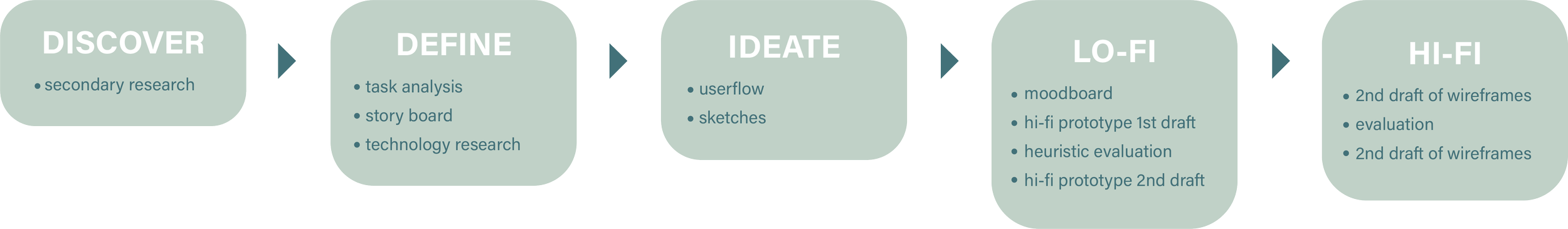

DISCOVER
Secondary Research
The EKO team’s research explored existing apps tackling food waste. While 16 apps focus on food sharing, they don’t address individual needs for organization and information to reduce waste at home.
Foodfully promotes pre-expiration consumption but requires manual deletion of used items, increasing screen time for users.
ImpactVision (for wholesalers) uses technology to assess food quality but isn't available to consumers.
OneThird (for retailers) uses AI for waste reduction but doesn't target individual consumer habits.
These solutions lack a user-friendly system for managing personal groceries and planning meals, creating an opportunity for our app, EKO.

DEFINE
Task Analysis
Through secondary research, we identified key user tasks. Our task flow diagram gives a bird's-eye view, guiding design toward user goals

Click to expand

The EKO team created a storyboard to illustrate the user journey, from scanning groceries to generating recipes, updating inventory, and saving favorites. This helped identify key interaction points to guide the design.
Storyboard:
IDEATE
User Flow:
Through iterative design, we defined the ideal user flow for completing key tasks within the EKO app. As showcased in the user flow diagram, the process is intuitive and efficient:
Effortless Input: Users can add groceries to their inventory in two convenient ways:
Scan Barcodes: Simply scan product barcodes with the app for quick and accurate entry.
Receipt Upload: Upload a grocery receipt for automatic product identification via EKO's AI technology.
Smart Management: After adding groceries, users can leverage EKO's AI features:
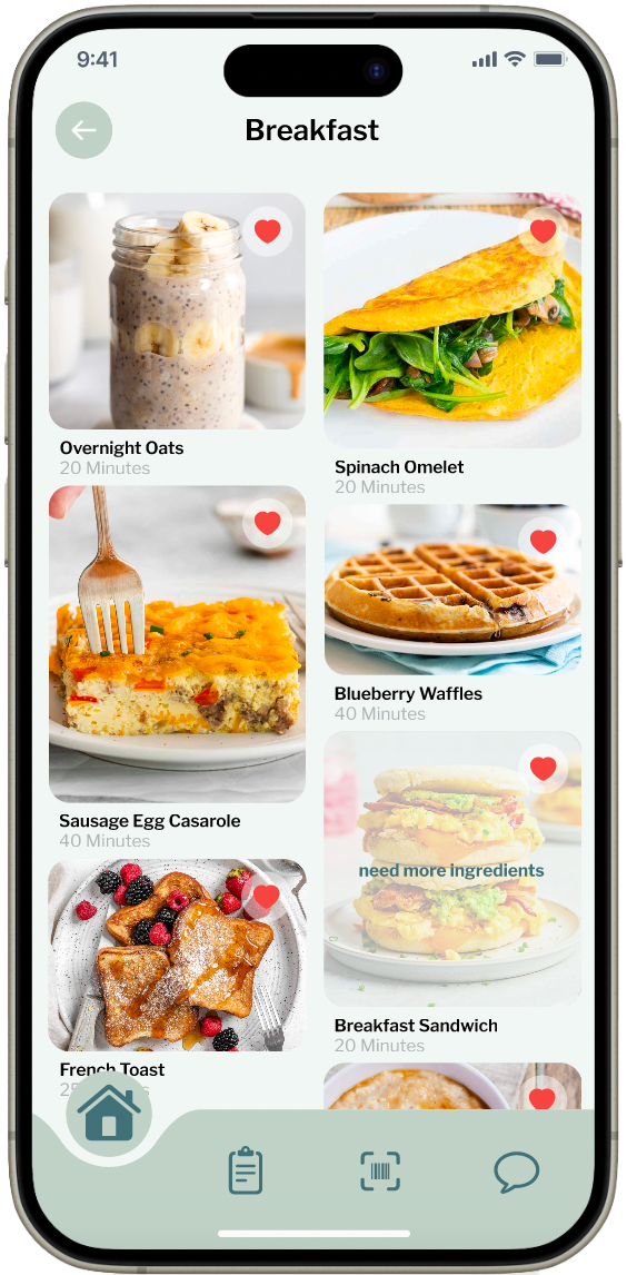
Recipe Generation: Generate delicious recipe suggestions based on the available ingredients in your inventory.
Inventory Management: EKO automatically removes used ingredients from your inventory, keeping it up-to-date.
Recipe Rating: Share your feedback by rating the generated recipes, helping EKO refine its suggestions over time.
Sketches:
Scanning a Product
Chat with EKO AI
Click to get a closer look!
Rated Recipe Card
Removing Items from Inventory
lo-fi prototype & test
First Draft Wire Frames
EKO AI Chat
Evaluation:
Recipe Card
Peer UX designers reviewed the wireframes with a clear understanding of the problem, solution, user flow, and design. Their feedback was crucial in refining the next stage of the app, with key insights highlighted in the Lo-Fi evaluation.
“How does the app know if you have enough? Is there an input where you can specify how many people you are cooking for?”
Recipe Discovery
Barcode Scanner
“This page is good. I would suggest when you click a food category, that it looks like the Pinterest style page. The three other wireframes are less engaging in comparison.”
“Organizing expiration date can become cumbersome to enter in with every item since that can’t be scanned through a bar code.”
Inventory
Waste Tracker
hi-fi prototype & test
Before
1
Interactive Prototype:
Following the wireframes, the EKO team developed an interactive prototype. We divided the key tasks within the app amongst the three of us and developed them each on our own. Making sure that all design elements were consistent and user centered.
A new set of 3 peer UX designers conducted a heuristic evaluation of the first version of the Hi-Fi prototype. Below is two observations/suggestions from the heuristic evaluation exercise.
“Love how this works, it’s really easy easy and intuitive. Only suggestion would be the have the favorites heart available on all of the recipes/pictures.”
“For this screen it is import to recognize, diagnose, and recover from errors. At the moment the readability is an issue on the tips screen because the scroll feature is being blocked by the home bar. I recommend making it longer and leaving more blank space so the last tip can be read.”
These findings were then used to develop the final version of the EKO Lo-Fi wire frames as shown below
Saved/like recipes page

After
hard to tell if you have already liked these or if this is a new feed
how can you tell if you have enough ingredients for each recipe?
added like button for better user awareness
added hidden recipe layer for better user awareness
Navigation bar iterations
2

This iteration was simple but draws too much attention away from the rest of the app. It is also just not readable.
Heuristic Evaluation:

This iteration was close but still not readable or functioning properly.
See how it works!
Landing Page
Tips and tricks page
Before
After

readability is poor
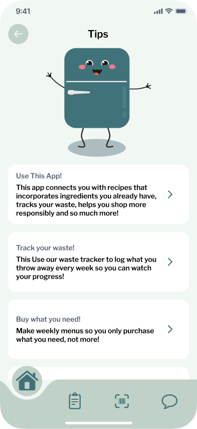
Improved readability
can now click for more information
EKO Icon

The last iteration is readable and functions in a dynamic and efficient way!
3
CONCLUSION
Developing the EKO app has been a major milestone in my UI/UX journey, allowing me to reflect on my strengths and areas for growth. I take pride in my leadership and team coordination skills, effectively delegating tasks and maintaining a strong design vision. My ability to shape the app’s aesthetic, including our dynamic navigation bar, contributed to a seamless user experience.
However, I recognize the need to improve my proficiency in advanced Figma features, such as interactive components, to streamline the design process further. This project also reinforced the importance of early-stage research and task analysis in building user-centered products—an area I plan to prioritize more in future projects.
If I were to expand EKO, I would enhance its grocery list features by integrating real-time store connectivity for a more seamless experience. Overall, I’m proud of what my team and I have accomplished and excited to continue growing in UI/UX design.
During the development of EKO the team utilized tools such as Figma, Illustrator, Photoshop, google, Chat GPT.
In crafting our project's copy and write-ups, our team relied on ChatGPT as a valuable resource, using it to optimize our time for more critical tasks. We used it for copy, and project write-ups. AI was never used for the design of EKO.
Meet the team!

Me! Lucy Law
design lead
responsible for: app navigation, the recipe hub, list section, and homepage

Gina Smith
logistics lead
responsible for: EKO AI chat, waste tracker, and scanner

Sage McCarron
system Interaction Lead
responsible for: inventory, login and splash page, manual inventory entry